Are 3 Column Websites a Good Idea Today?
Home >> Web Design

When I first started building websites in the late 90s, three-column designs were growing in popularity because they gave you more real estate to work with.
You could use your main column for your content and you had two extra sidebars for advertising, navigation and whatever else you needed.
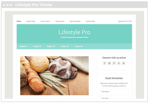
Times have changed, however. Today simplistic designs are in. More and more people are opting for cleaner, one and two column layouts as seen below with the Genesis Lifestyle Pro theme.
Also, because people are now viewing websites on mobile devices more than ever, 3 column designs present another challenge...
They can be difficult to read.
No doubt you've visited a website on your phone with 3 columns and had to use the pinch and zoom feature just to read the content.
What a pain!
Of course you can remedy this by using a mobile responsive design (which means your content automatically adjusts for easy viewing on smaller devices).
In most cases, a responsive design will drop the sidebar columns down below the main content so the entire site displays in one column.
But even in that case, a 3 column site becomes one very long one-page site when viewed on smaller devices.
By the way, there's no way you should ever build a site today without making sure it's mobile responsive. There are too many themes out there that are setup this way out of the box. Even the default WordPress theme is responsive. There's just no excuse not to have one.
Too Many Options?
Another issue 3 column designs present is they create too many choices for the visitor, which can overwhelm them and prevent them from focusing on your most important links and content.
We have a tendency to believe that the more links, buttons and images we add to our designs, the more pages people will use them, but too many options can actually have the opposite effect.
More is not always better. Too many options in your sidebars can paralyze your visitors and they may not know what to click.
Usability tests have shown that the fewer options you give your readers the better.
So when your site is only one or two columns long with minimal navigation choices, you can guide them where you want them to go more effectively.
In Summary
Obviously there's no right or wrong when it comes to how you choose to design your site. No doubt there are three column sites that work well and are appropriate for the site's goals and needs.
But I do believe it's better to keep your design down to one or two columns, and if you must use 3 or more columns, please make sure you have a responsive design.
Ready to create your site? Start here!
Learn the basics of designing a website here.
If you liked this, please share. Thanks!

 Hi, my name is